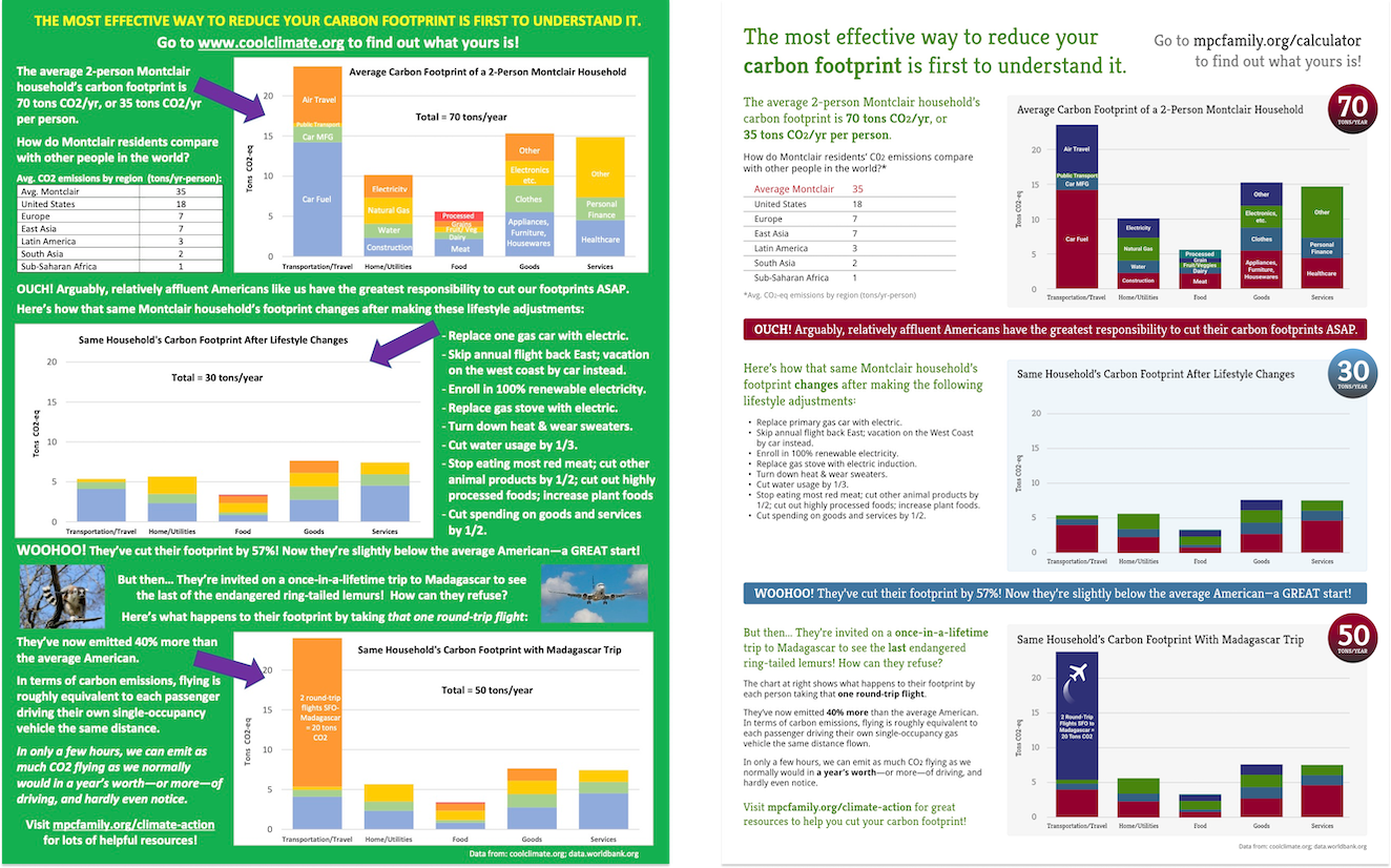
I was recently asked to redesign a climate change “call to action” flyer for a local church. It was a fun project, and process I followed ended up being a good illustration of my general design approach.
Design Principles
While redesigning the flyer, I had several principles in mind:
- Align with branding: the church uses specific fonts on its website and printed materials, so the same should be used here to make it appear to be part of the same design “family”. Accordingly, I used Kreon for headings and Droid Sans for body text in the new design.
- Ensure accessibility: to make sure that the page could be easily read by folks with vision difficulties, I only used colors that met the WCAG foreground-to-background contrast ratio of 4.5:1. That meant a number of changes, including:
- Darkening the main green shade used in the flyer
- Creating a darker color palette, based on that green, for use in charts and color highlights
- Switching from a green background to a white one, and making sure all text was sufficiently dark
- Adding visual hierarchy and white space: the original design was cluttered and lacked a sense of visual ‘flow’ through the page. The updated design uses headings and other variations in font size to make the page easier to skim, and to lead the eye through the various messages in the flyer.
- Highlighting key takeaways: one page in the flyer included critical carbon footprint numbers. The new design gives them much more prominence, and uses red shades to indicate ‘bad’ numbers vs. a cool blue for ‘better’ numbers.
Yes, but is it an improvement?
I’m proud of the results, so I think so. You can decide for yourself by viewing the full ‘before and after’ comparison in this PDF of both versions (6MB PDF).