Overview
Purpose: Redesign a Find a Provider tool used by hundreds of thousands of members and providers over 30 U.S. health plans.
My Role: I co-led the wireframe creation process and then took on the role of UI/UX lead: revising and presenting design concepts, running user testing sessions, and delivering final design and code assets.
Timeline: Eighteen months; the overall project will be completed by the end of Q1 2021.
Context: This work was done while I was an employee of Centene Corporation, a healthcare company that owns health plans — Medicaid, Medicare and Individual Plans — throughout the U.S.
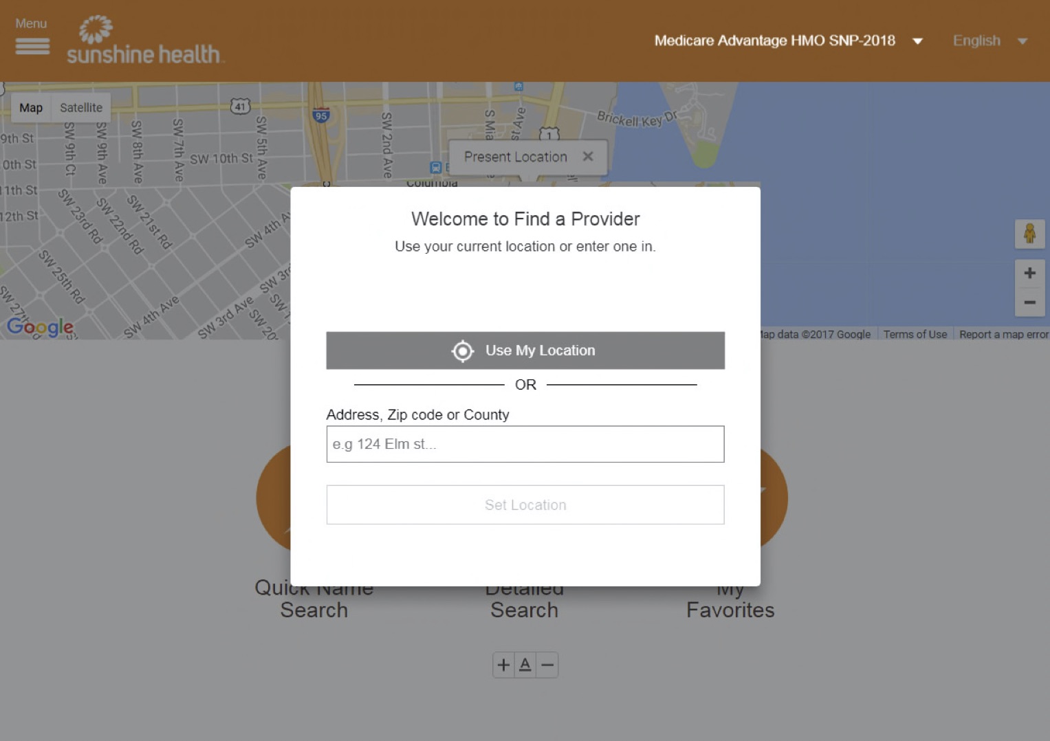
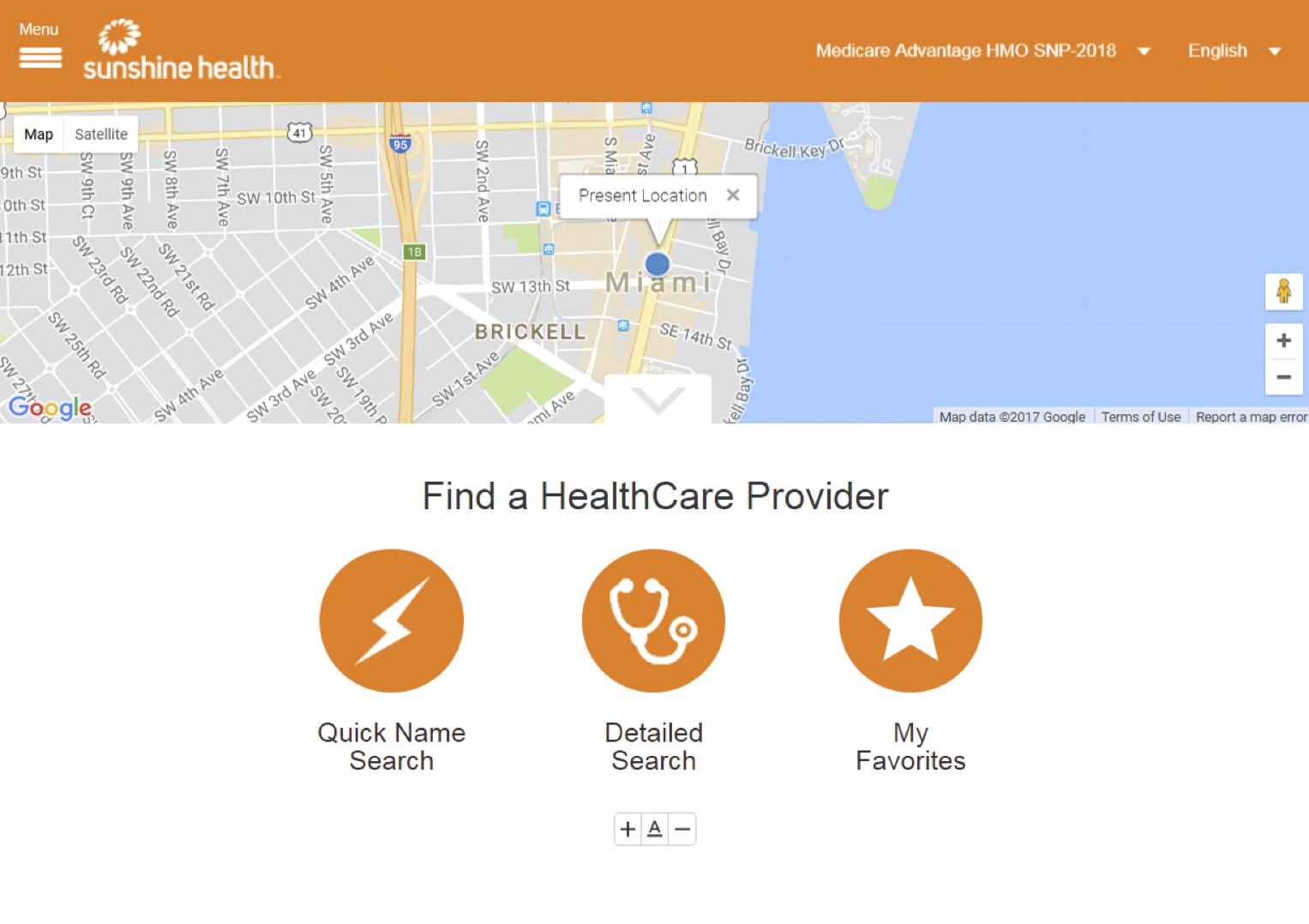
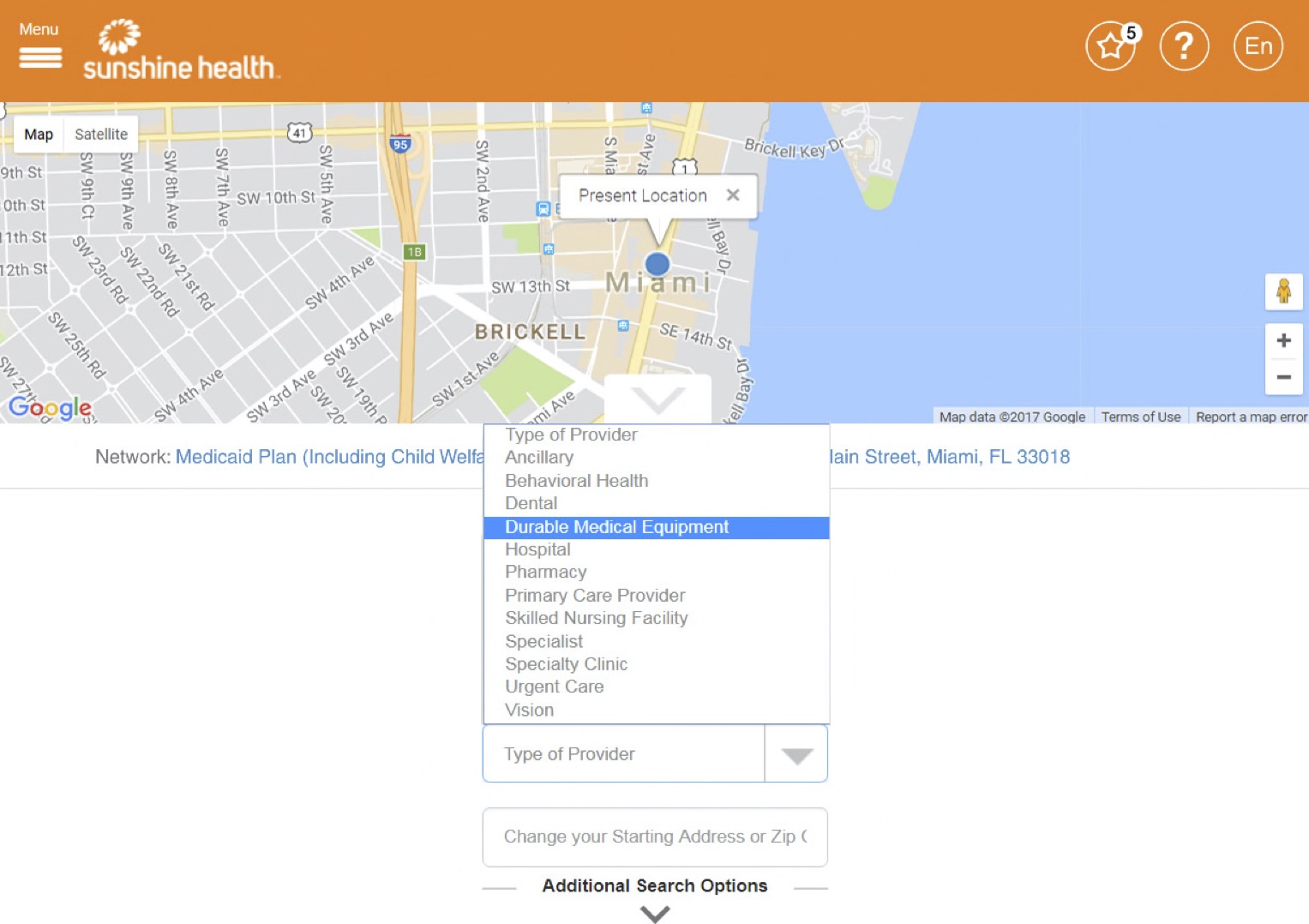
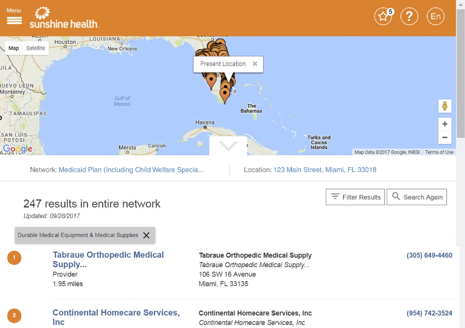
Prior to the Redesign
Some views of the Find a Provider tool (Sunshine Health branded) before the redesign process began:
Project Goals
Business drivers and goals for the redesign included:
- Reducing calls to the Customer Support center. Centene employs tens of thousands of call center reps, and many calls relate to issues with finding a doctor. The goal was to reduce doctor search-related calls by twenty percent.
- Fix a range of accessibility (Section 508 compliance) issues in the current design, an especially important task given the large number of Medicaid and Medicare users. Issues included:
- Multiple color contrast issues, especially when the tool was branded for a health plan whose primary color scheme was too light to offer sufficient contrast. The image below shows Sunshine Health’s branding; their main branding color is an inaccessible orange.
- A wide range of code-level problems, including improperly-coded forms, focus management issues, and a general code structure that made life difficult for screen reader users.
- A tendency to use nonstandard interactive elements, chosen for appearance rather than functionality, that increased cognitive load for disabled (and really, all) users.
- Improve general mobile-friendliness of the tool by optimizing the interface for that form factor and making better use of precious screen real estate.
Research
The research phase for this project took many forms, including:
- Meetings with external research/design agencies
- In-person discussions with current members
- Multiple unmoderated user testing sessions, completed via UserZoom, several of which I designed and analyzed. Test types included heat map click tests, Invision prototype navigation, and general questions about design appeal & clarity.
Wireframing
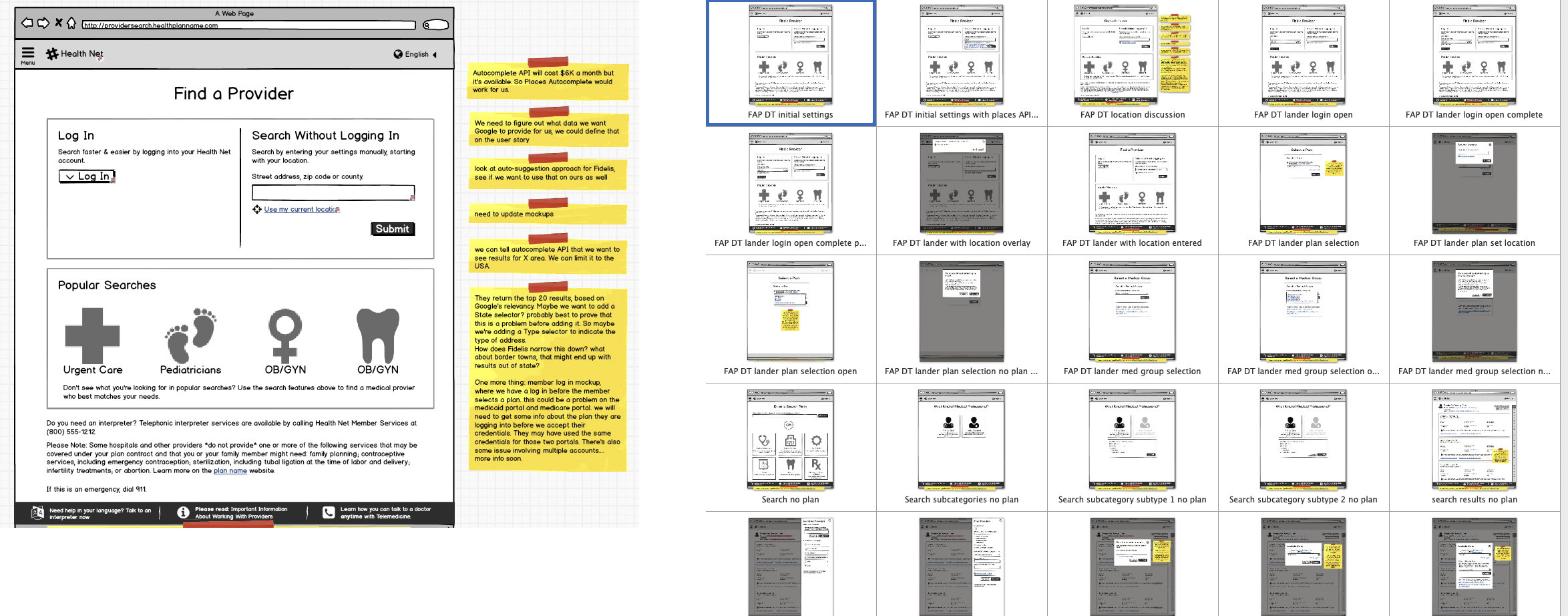
My tool of choice at the time was Balsamiq; it’s ideal for spinning out quick layouts and interaction flows. I particularly like it because its ease of use encourages design exploration without feeling too committed to a concept too early in the process. Also, the unpolished “this is obviously a sketch” appearance helps stakeholders focus on the general experience without getting hung up on pixel placement.
Design & Development
Once the flows and general UI concepts were basically finalized, it was time to create polished designs, HTML mockups and graphic assets for collaboration with the development team. The process ended up being particularly tricky because technical issues and resource constraints made it necessary to redesign the Find a Provider tool gradually, which is a bit like rebuilding a car’s engine while driving down the freeway. This meant supplying transitional designs as well as final ones, which was an interesting challenge!
My collaboration with the dev team worked like this:
- I took part in agile ceremonies: daily standups, sprint planning sessions and retros, to make sure I understood what assets or design guidance would be needed next.
- At the start of the process, I shared polished Sketch designs as Invision prototypes, and exported assets (primarily PNG and SVG files) for dev usage. As the project went along, we shifted to Sketch + Abstract (the latter is a Sketch versioning system that also includes inspect/collaboration features). In the project’s final months, we shifted platforms again, rebuilding the Sketch files in Figma and sharing assets and prototypes with dev that way.
- All the work was tracked as user stories; I worked with Find a Provider business analysts to address any corner cases and to make sure I was delivering what the dev team needed.
- I was in frequent communication with the dev team, typically clarifying UI intents, offering CSS guidance, and in some cases creating HTML models that they could use as a basis for their Angular code.
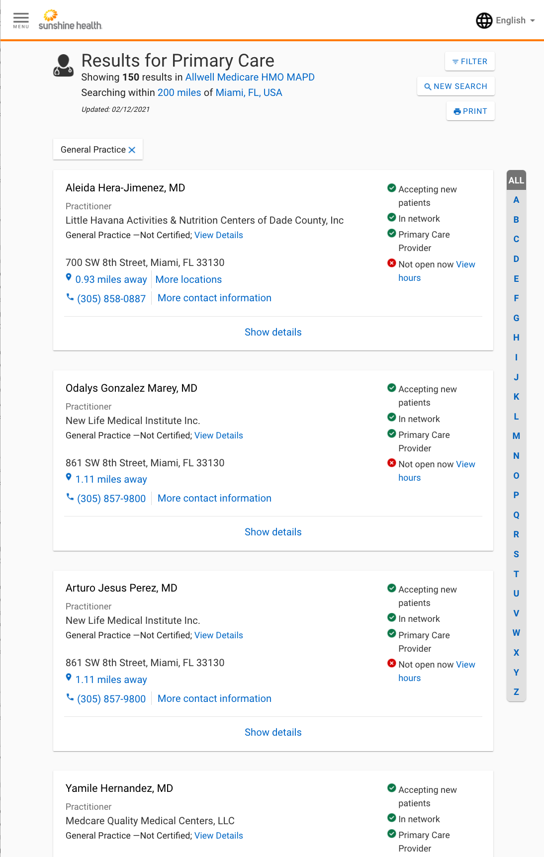
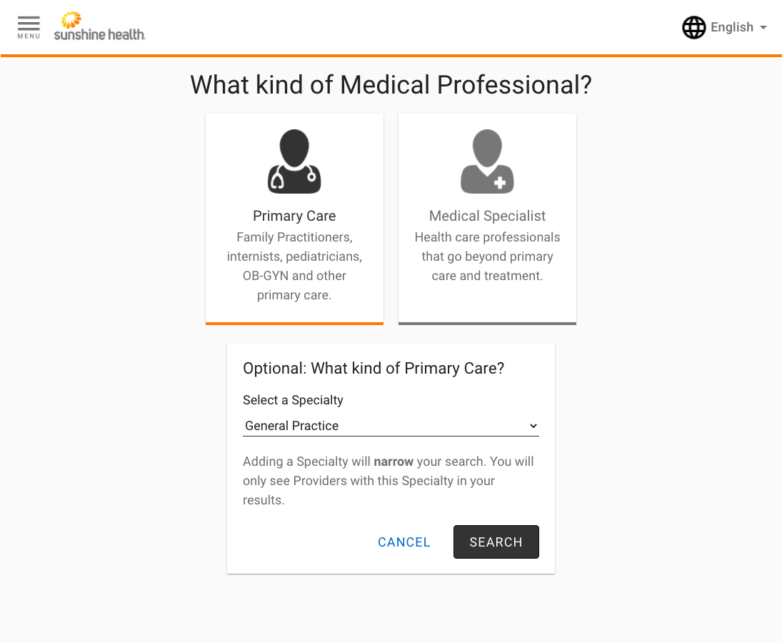
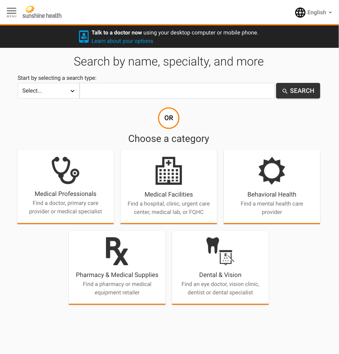
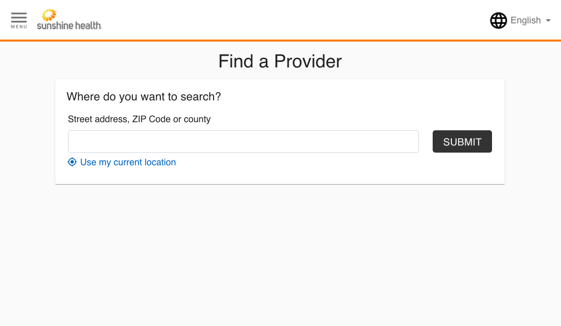
The Final Product
As of this writing (early February 2021) the redesign isn’t 100% complete, but I’m proud of what the team has accomplished so far, and my key role in making it happen. Here are some sample screens of the mobile-friendlier, accessibility-focused, modern & clean, updated Find a Provider interface: