Overview
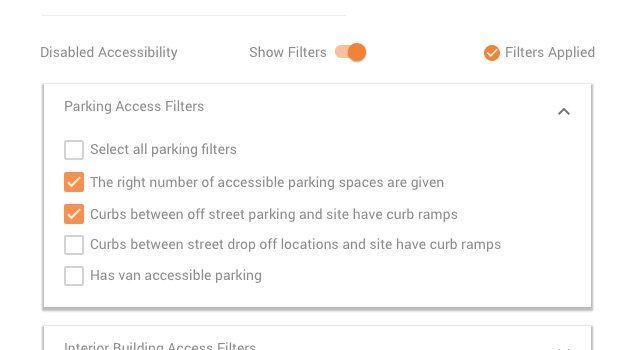
Purpose: Improve the experience of users with disabilities when they search for healthcare providers by adding extensive Accessibility Filters to my company’s Find a Provider (Doctor Search) tool.
My Role: As the UX/UI lead, I created, presented and refined wireframes. I also created the final visual design and delivered graphic and code assets to the dev team.
Timeline: Four months (my part); the overall project is still in development.
Detailed Goals
- Ensure that the solution was in itself accessible for people with disabilities
- Display the filters such that they would be easily usable by folks who needed them, but that didn’t impede searches by those who did not
- Make use of existing conventions in the Find a Provider tool specifically, and in Material Design generally, to maintain consistency and avoid reinventing the wheel
- Look for opportunities to improve the 508 compliance of the overall Find a Provider tool
- Watch for reading level problems: much of the original documentation was written with federal and state guidelines in mind, so the first draft of the text was full of legalistic, stilted jargon.
Sketching Phase
- Used Balsamiq (my go-to sketch tool) to create rough wireframes.
- I’m a big fan of the tool because it’s possible to create complicated flows quickly.
- The ‘sketchy’ style helps stakeholders focus on the flow instead of getting hung up on visual design details
- I ran solutions past stakeholders to make sure the solution fit the requirements, and went through multiple rounds of refinements.
Working With Development
- My front-end development experience comes in handy when conferring with the dev team.
- In this case, being able to ‘speak developer’ helped us uncover a problem with the design concept: that part of it couldn’t be supported with the existing code base.
- Result: I revamped the approach, reviewed it with dev for feasibility, and returned to business stakeholders to get signoff for the change.
Reviewing and Revising with Stakeholders
- Background: I’m always careful to explain the rationale behind my UX and UI decisions. This helps with buy-in, and also helps us focus on discussions of user experience vs. pixel adjustments.
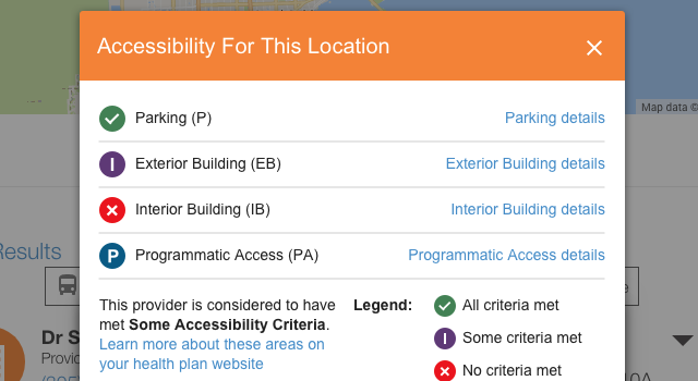
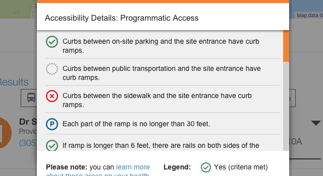
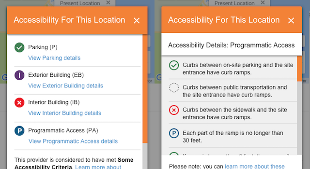
- For the most part, stakeholder review (29 regional plans!) was successful, except with the Texas team: they pointed out that my some icon choices were too binary, and gave patients the impression that a provider who was partially accessible wasn’t worth considering.
- Result: revised icon designs that fit the requirements and gained stakeholder approval.
Concurrent Improvements
- Working with the marketing team, I crafted copy rewrites that would lower the reading grade level for filter descriptions, disclaimers, and legal notices.
- Working with the dev team, we figured out a way to fix contrast issues in the tool’s header. It was outside the initial scope of the project but supported the overall strategy.


